Data and Visualization: MarketWatch, SmartMoney and DJX
The Market Watch iPad app, the Smart Money Retirement Planner, and DJX are financial data visualization tools. For both casual users and experts, data visualizations, whether an overview or an experience, provide a way to see the bigger picture.
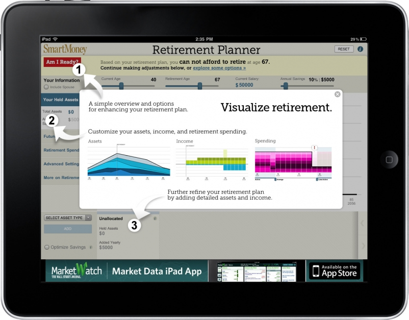
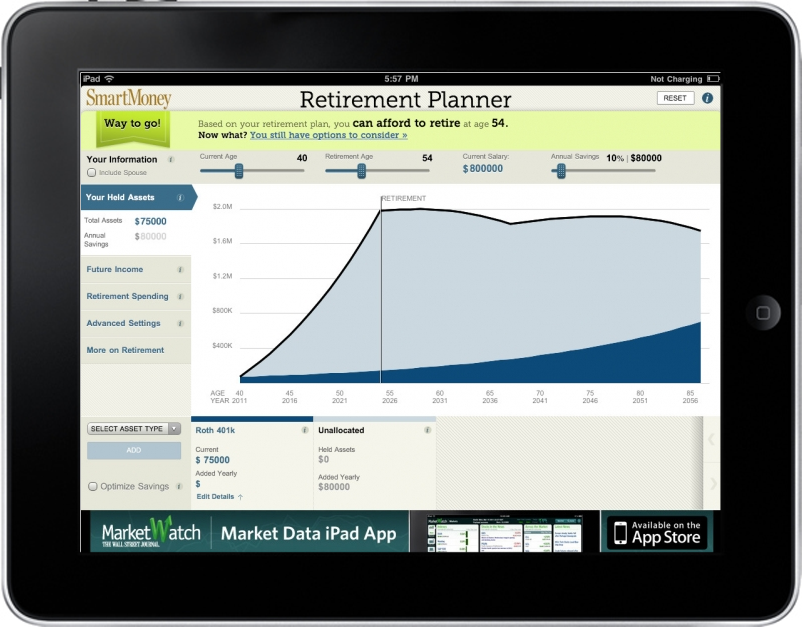
The Retirement Planner enabled users to explore and model options for retirement. Since personal finance is both broad, speaking to many types of users at all different stages, and deep, being complicated and often emotional, it needed to be approachable, intuitive and work for multiple levels of users .
For people who are just starting to think about retirement, or who are intimidated by the idea of financial planning, it has a simple, intuitive interface which allows them to quickly see if they’re on track for their goals. More in-depth controls are provide for users who are more experienced and want to dig deeper.
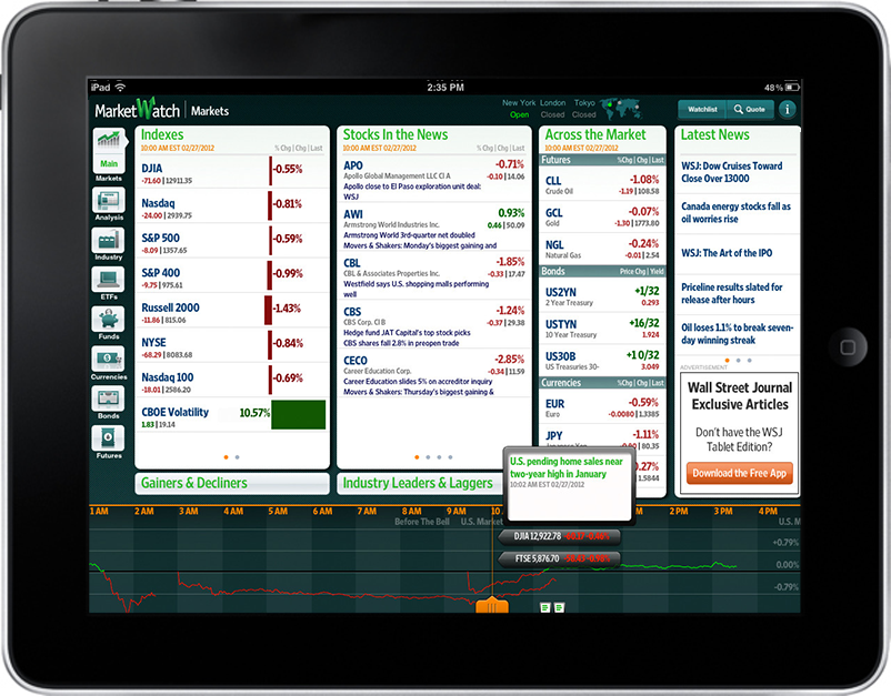
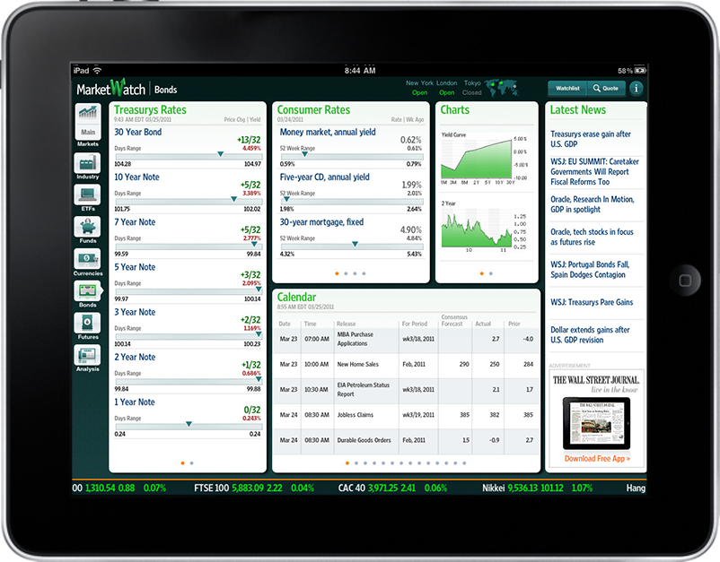
The MarketWatch iPad app was created for personal investors, and delivered breaking markets and business news headlines, full-stories and real-time commentary throughout the day. Nicknamed the markets data DVR, the user could navigate back in time using the indexes at the bottom to catch up on news or locate articles tied to a specific market movement.
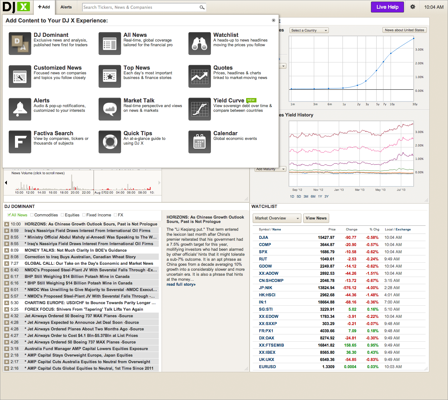
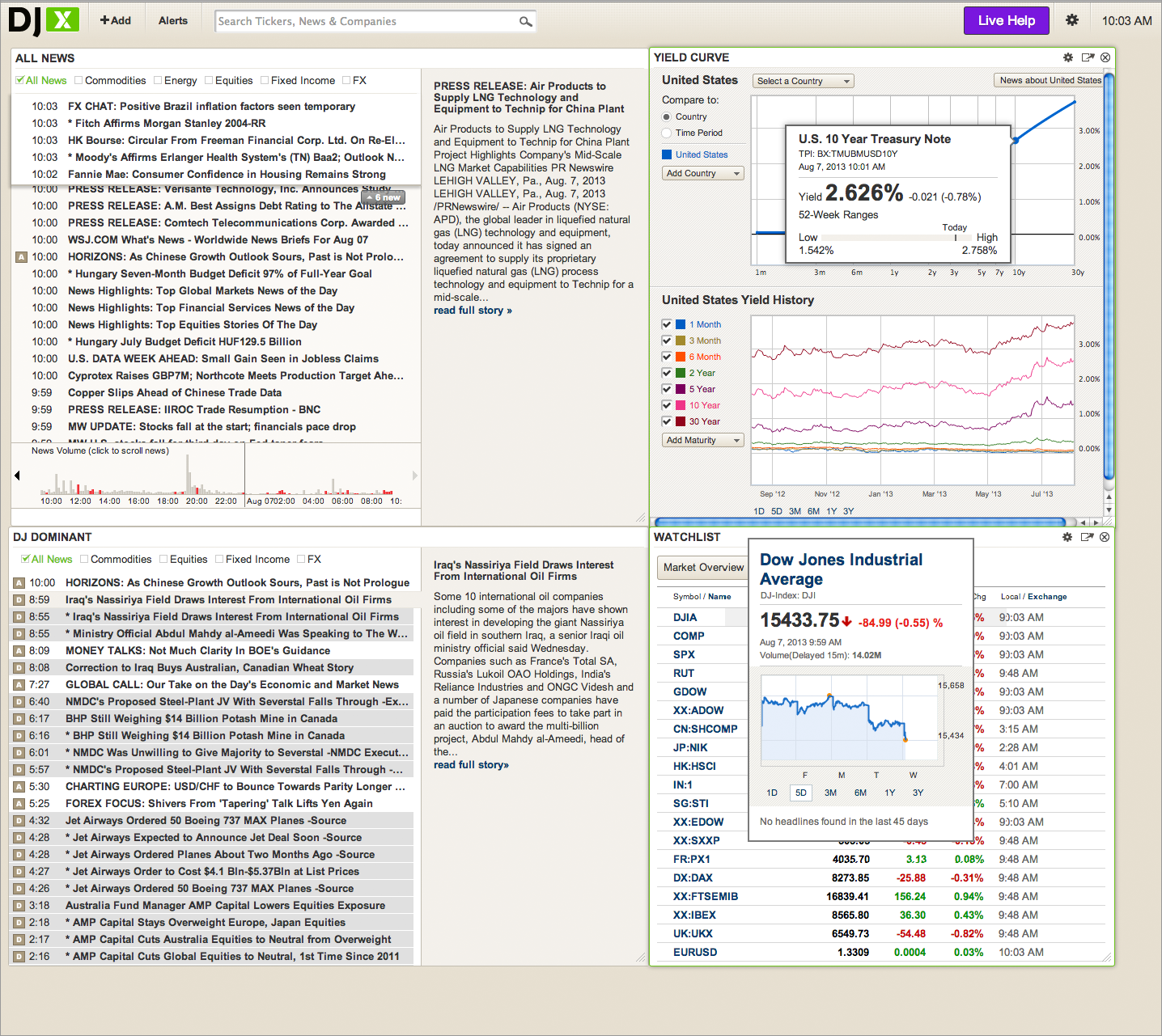
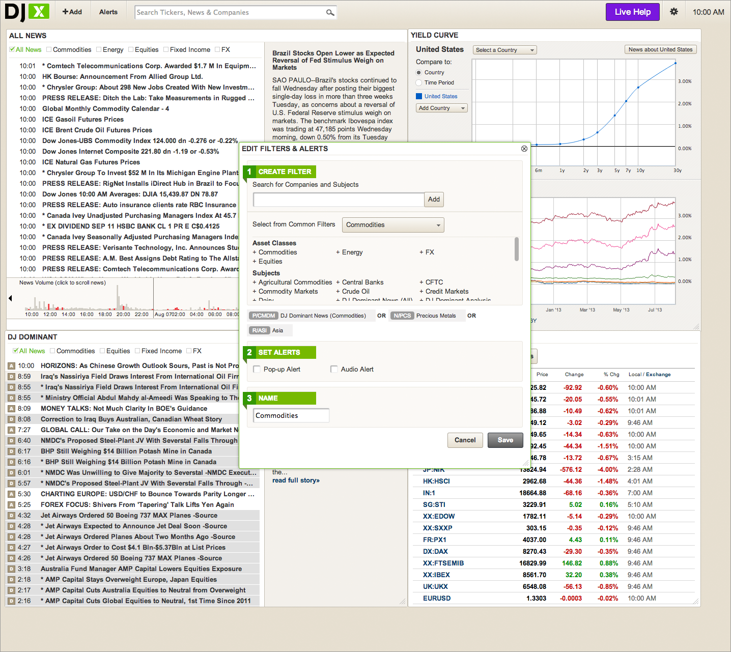
DJ X (Realtime) was designed for users who follow the market intensely. Its more dense interface can be extensively customized and contains real-time institutional news with DJ Dominant – proprietary Commodities, Equity, FX and Fixed Income news exclusive to Dow Jones.
