Engaging Users: Factiva UX Overhaul
Factiva is an incredibly powerful product, and users rely on it to find, analyse and share information from 20,000 publications. However, its outdated interface keeps even its most dedicated fans from seeing all of its great features, and overwhelms novice users.
The screenshots below are part of a 3 month exploration focused on improving the user experience, while maintaining the core structure of the product. They explain how we got from A to B, and highlight the value of:
- User Interviews
- ProtoPersonas
- Feature Usage Analysis
- Navigation and Content Analysis
- Participatory Design
- Prototyping and Testing
- A Great Team
Continued growth, without attention to what features are most valuable to the overall user experience, has created pages that are uninviting and needlessly complicated. Features and benefits are not obvious to users, who are dependent on customer service and account executives to use the product.
- Develop a holistic, overall view of the product to drive systematic design changes
- Provide a consistent user experience and establish UX guidelines for all future Factiva products
- Generate time savings and staff productivity by reducing unnecessary UX discrete decision-making in every project sprint
- UX Goals: Compact, Consistent, Clear
- Product Goals: The interface and features offered need to keep researchers happy, but they also need to make is easy for all users to see the benefits Factiva offers
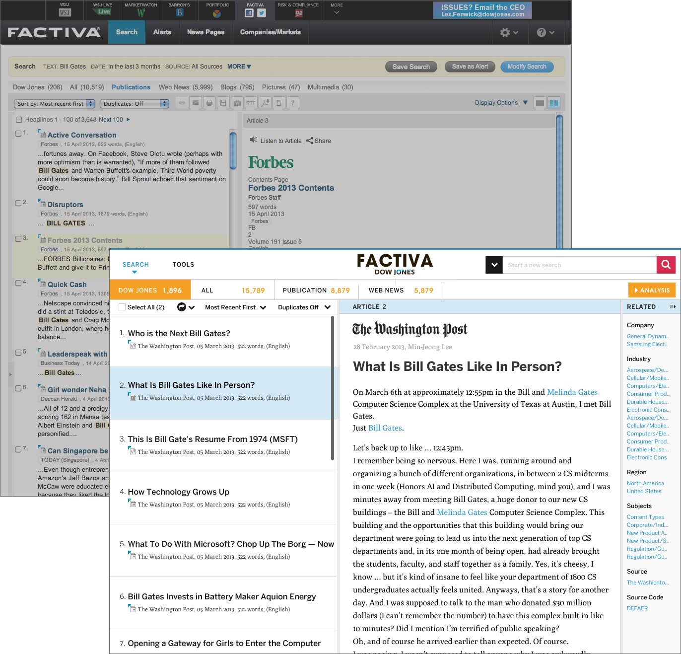
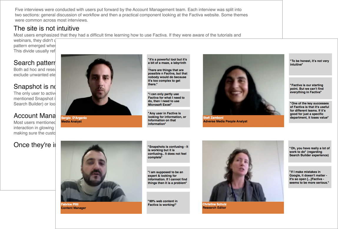
User interviews were conducted with Expert Users (DJ editors who use Factiva on a regular basis as part of the Risk & Compliance and Adverse Media teams) and Novice Users (customers who had signed up in the past 6 months).
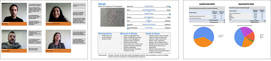
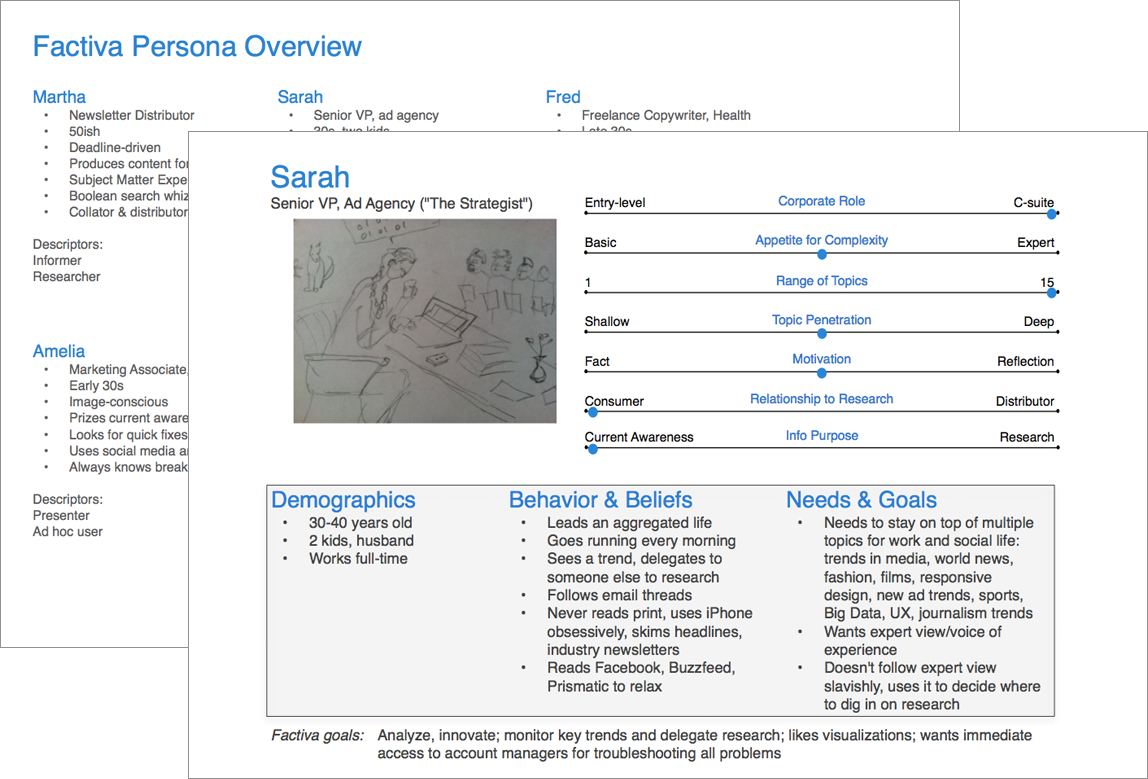
A key goal is understanding the users needs, and what benefits we can offer them. An obvious place to start is with an ethnographic study, but when this research is too time consuming or not appropriate, a good alternative is a proto persona workshop. This workshop brings together key stakeholders and takes advantage of their domain expertise to describe different users. Through participation, the team gains a shared understanding of the users they value and the project goals.
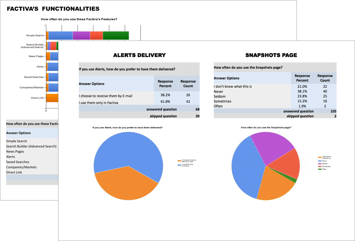
To understand what features current, expert Factiva users value the most we conducted an online survey.
Note: Due to the privacy concerns of its clients, detailed metrics were unavailable. Normally, an analysis of site usage would be done as well.
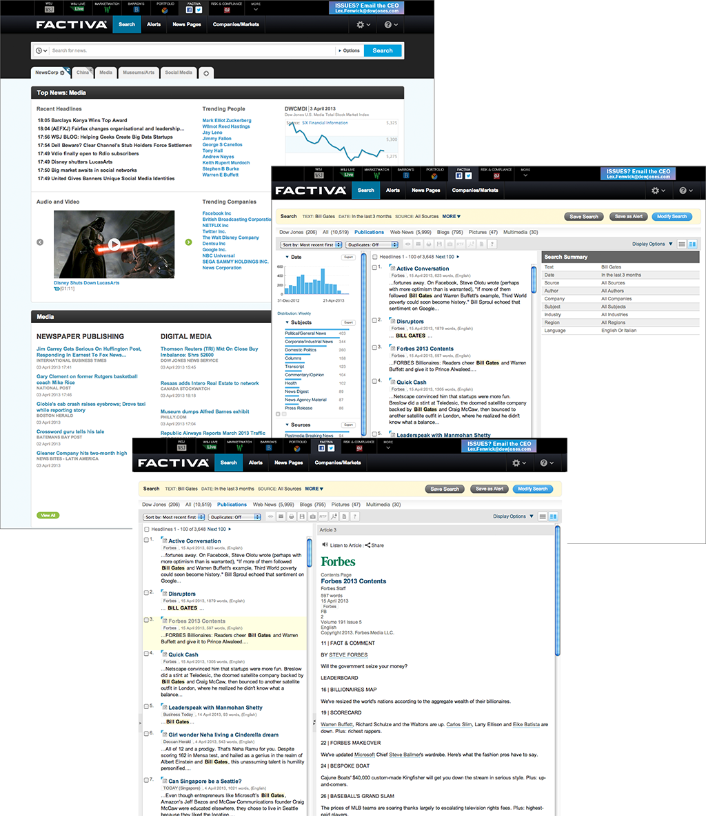
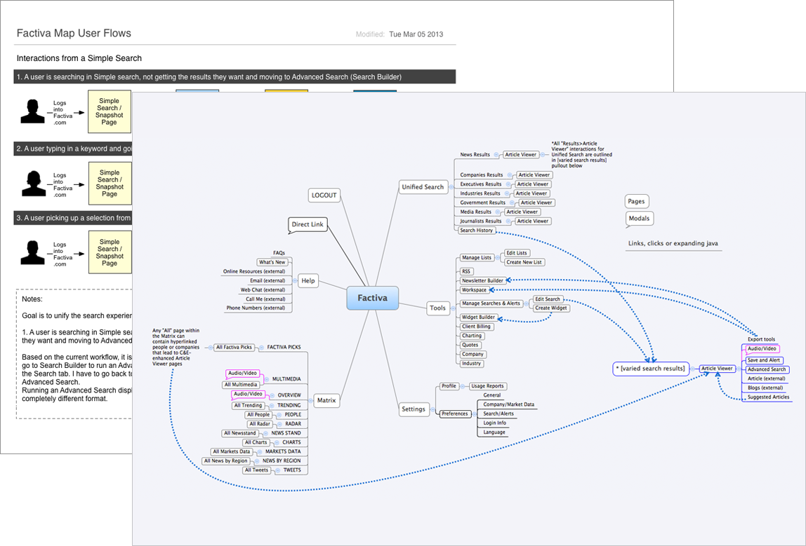
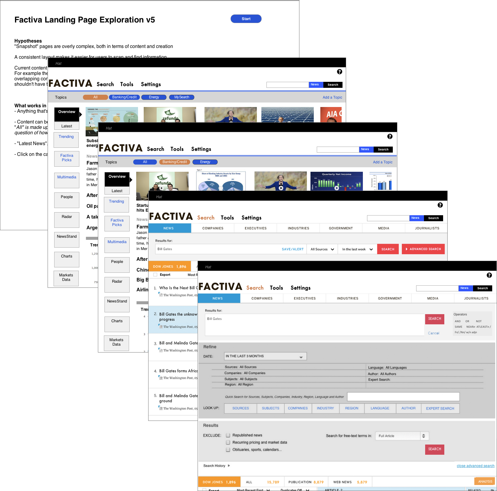
Navigation and content are two of the most complex parts of Factiva. The first image outlines a problem with the user flow through the search process, and the second image proposes a simpler structure for the site.
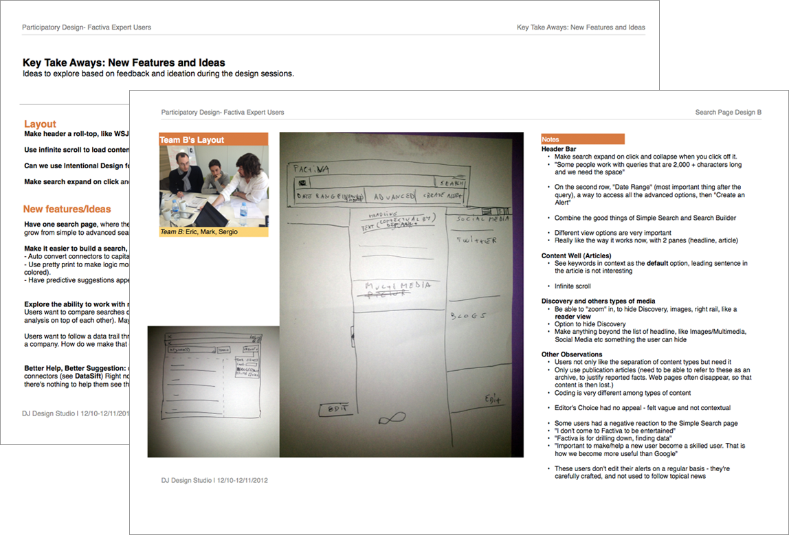
A Participatory Design session allows the people most invested or affected by a problem to propose solutions. Typically, participants are broken into small teams, each producing a sketch of their ideas, which they then collectively present to the larger group. The goal here is not to define the final UX, but instead to brainstorm, further refine requirements, and discuss priorities.
Testing of quick prototypes allows for experimentation and rapid, iterative development of ideas and solutions.
The result is a holistic view of the product that can work for both expert and novice users. Features are organized to reflect user tasks, and improved organization makes functionality more apparent and accessible. An updated visual look is more engaging, and a consistent design vocabulary makes the site easier to use.
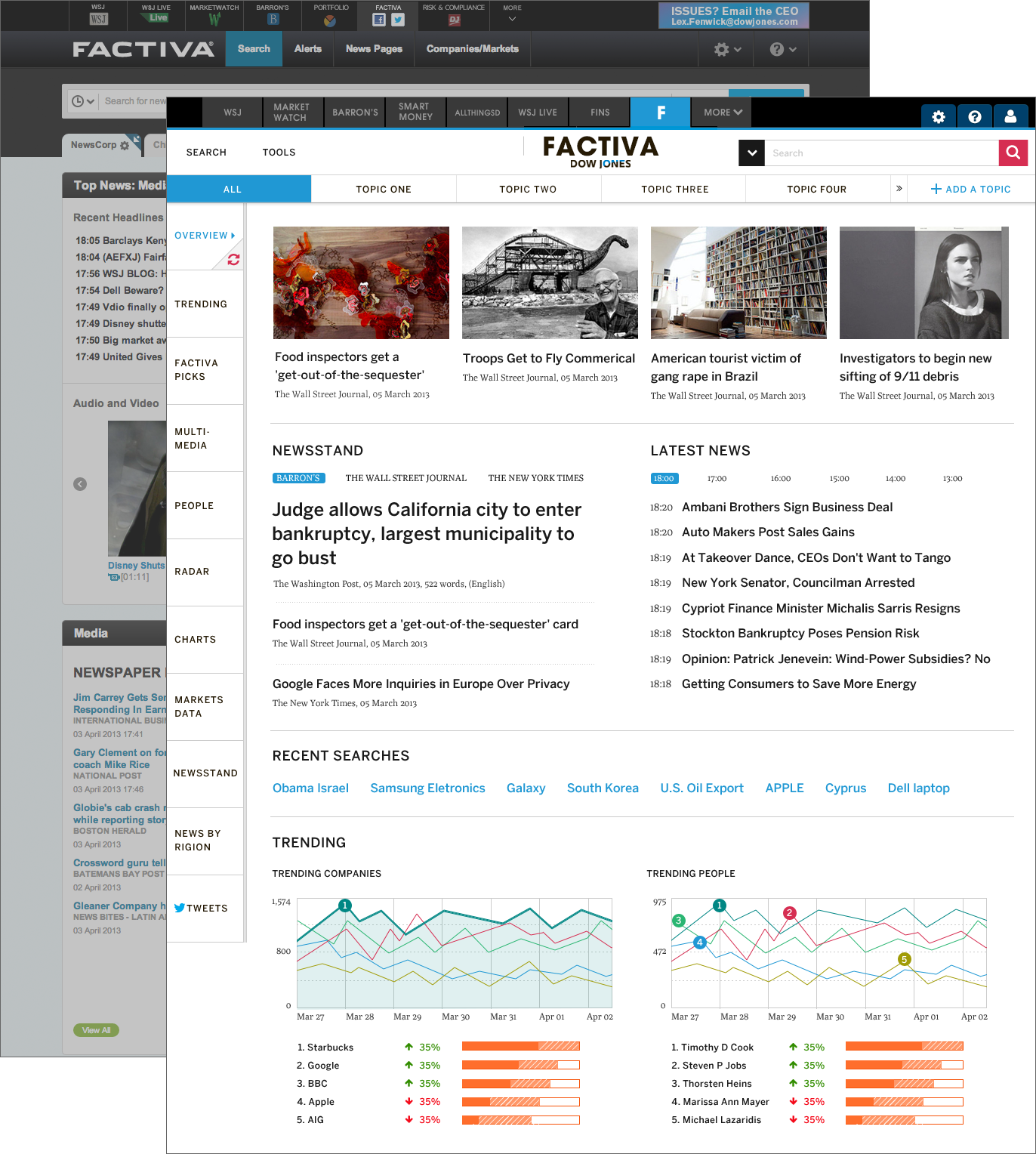
The new landing page allows users to quickly add and remove topics, and to view them collectively or individually.
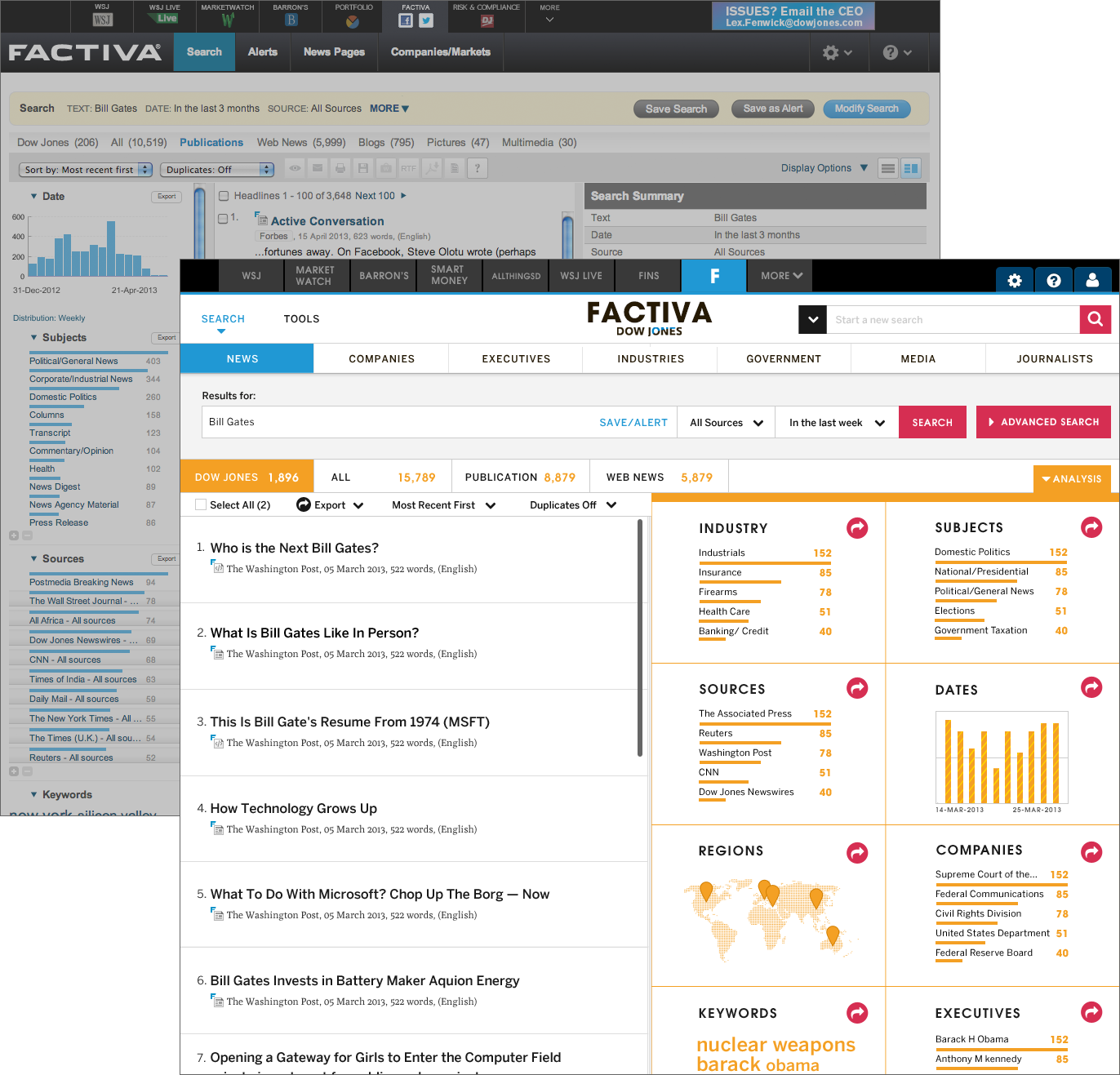
A revised search page highlights key functionality.
Better article pathing makes it easier for users to read a set of content